TATA BOLT /
Web Portal for Insurance
End-to-end insurance policy journey
Project Scope:
Zero to Launch
Team Size:
1 PM, 6 Dev, 1 Designer
Duration:
9 Months
Platform:
Mobile/Desktop Web
Insurance
Redefined
Coverage shouldn't be complicated. Issue any policy, for any client, in just a few clicks.
Retention
Adoption
Revenue Inc
Task Time
Outcome
Here is how the final solution moved the needle for the business
© Summary सारांश
User Metrics
© Introduction परिचय
OLD experience
Context
Old Portal
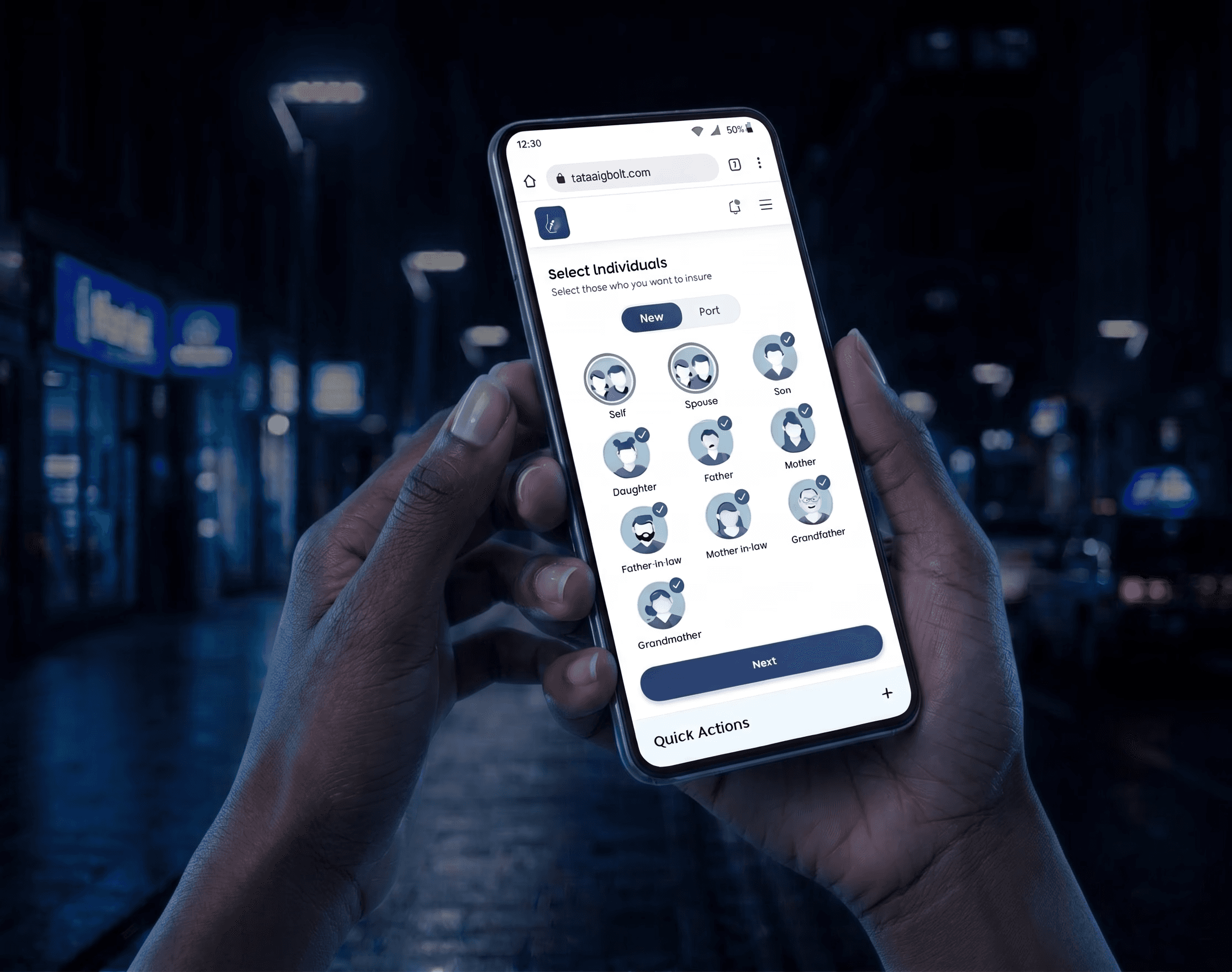
We needed to Design Bolt from the ground up a portal that fits how agents actually work, validated by research, and scalable enough that its design language (the Bolt Design Library) could serve other TATA AIG products including Nova.
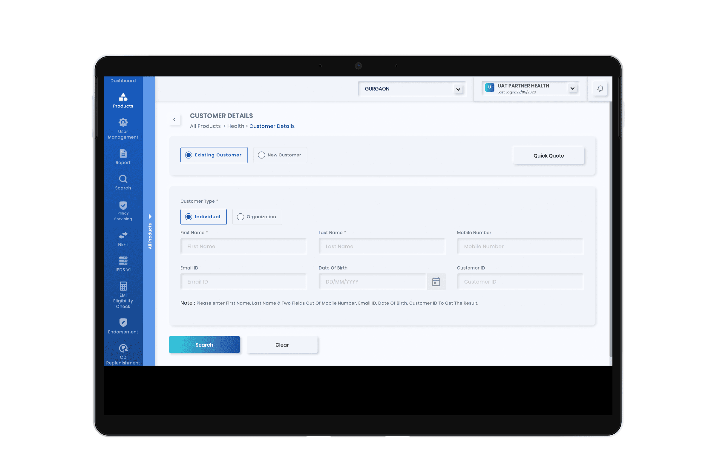
IPDS V2- The Old Portal
A legacy portal built around the insurance company's internal data requirements. not around how agents actually work. It issued policies. But it made agents jump through hoops to do it.
Agents weren't using it the way it was intended. When asked what they use to generate quotes, the answers told the whole story Agent AUX, M-Connect, Excel spreadsheets,
and the portal itself used only for final policy issuance, not for the quote generation it was built to support. Agents had built their own workaround ecosystem because the portal didn't fit their workflow.
© Challenge चुनौती
to overcome
© User Research अनुसंधान
What Users Say
User Research
More than 85% of the people in India buy insurance policy from an insurance agent
I conducted approximately 8 interviews with practicing insurance agents across experience levels and business volumes from agents writing ₹62 lakh annual business to those writing ₹1.1 crore+
A deliberately mixed set covering product specialisations, geographies, and working styles.
A structured questionnaire was prepared ahead of each session. However, agents were more than happy to share experiences beyond its scope often the most valuable insights came from these unscripted moments. Every observation was captured, and several became defining design decisions in Bolt. These were the main insights that directly shaped Bolt
Agents use the portal for issuance, not quoting
Most agents had abandoned IPDS V2 for quote generation entirely. They used third-party apps like Agent AUX and M-Connect because those were faster and showed premiums across multiple companies. The portal was a last step, not a first one. Bolt had to earn back the earlier stages of the journey.
The quote input form was asking for too much, too early
Before getting to a product listing, agents were entering unnecessary data. Research revealed the minimum viable input set: number of family members and their relationship to the client, their ages, and their pincode. That's it. Everything else could wait until the proposal stage. This single insight defined the entire pre-listing experience.
Mobile number and email should not be required for quote generation
Multiple agents flagged this explicitly. Requiring contact details before a client has decided anything creates friction at the wrong moment and erodes trust with prospective policyholders.
A bug disguised as a feature
A 5-minute OTP before sending a payment link in a real-world scenario where an agent is on a call with a client was causing form data loss and re-entry. One agent noted this had been partially addressed (proposal number retrieval), but the root experience remained fragile.
Payment journey needs rethinking
The label "send link to customer" was functionally misleading. What agents needed was "generate payment link" something they could copy and send via WhatsApp, SMS, or any channel they were already using. A labelling and flow problem masquerading as a technical one.
Alternate contact details for payment are a real workflow need
In many cases, the person paying isn't the policyholder it's a family member. The portal had no field for an alternate email or phone number for the payment link. Agents were working around this manually.
DigiLocker-style auto-fill is the benchmark
One agent specifically mentioned a competitor portal (Care Health) that auto-fills all fields from a PAN card number and date of birth via DigiLocker. This set a clear expectation benchmark for what effortless data entry looks like.
Quote output needs to be shareable directly
The current portal showed only premium on the quote screen — no sum insured, no product summary. Agents were taking screenshots to share information with clients. A shareable, formatted quote output was an unmet need with immediate business value.
© User Personas यूज़र पर्सोना
User Classification
User Personas
Summary
After interviewing 8 insurance agents, three distinct personas emerged. Anjali is a socially savvy, full-time agent who blends networking with lead generation, using WhatsApp Business, Canva, and Instagram to build her brand and manage clients. Saanvi is a steady, relationship-driven agent who keeps things simple phone calls, WhatsApp, and internal tools are all he needs to maintain his loyal client base. Kabir is a young, part-time agent treating insurance as a side hustle, casually pitching to peers through Instagram and WhatsApp, and engaging with the platform mainly for quick quotes and commission tracking. Since, high yield agents are already doing well, we would like to see the other two kind of users to perform better as well. Especially the type 3 user, the potential is massive, even if we are able to transition just 10% of them to type 2 user, that would mean success for us.

01
/ 03
Anjali
Age
46
Anjali seamlessly blends her personal and professional life by turning community networking into organic lead generation, while enjoying financial podcasts. She uses WhatsApp Business serving as her absolute lifeline for client communication and Truecaller helping her efficiently screen daily leads. To build social proof and project a reliable image, she designs personalised quotes and festival greetings using Canva and shares them across Facebook and Instagram. For her ongoing development and daily operations, she relies on YouTube for quick micro-training on sales techniques, uses UPI apps for seamless premium collections.
Role
Self employed
(High yield agent)
Ways of working
Manages a team of Agents/ Data entry operators
Has years of experience
Knowledgable
Uses portals like Agent AUX
Choice of device: Laptop
Uses Whatsapp to send documents/ links to clients
Deals with other insurance companies as well
01
/ 03
Anjali
Age
46
Anjali seamlessly blends her personal and professional life by turning community networking into organic lead generation, while enjoying financial podcasts. She uses WhatsApp Business serving as her absolute lifeline for client communication and Truecaller helping her efficiently screen daily leads. To build social proof and project a reliable image, she designs personalised quotes and festival greetings using Canva and shares them across Facebook and Instagram. For her ongoing development and daily operations, she relies on YouTube for quick micro-training on sales techniques, uses UPI apps for seamless premium collections.
Role
Self employed
(High yield agent)
Ways of working
Manages a team of Agents/ Data entry operators
Has years of experience
Knowledgable
Uses portals like Agent AUX
Choice of device: Laptop
Uses Whatsapp to send documents/ links to clients
Deals with other insurance companies as well

02
/ 03
Saanvi
Age
28
As a solo, medium-yield agent, Saanvi builds her business on steady, long-term relationships. Her digital routine is functional and straightforward, relying heavily on standard phone calls and WhatsApp to personally manage her loyal client base without the complexities of team coordination. She uses apps like Dailyhunt or Moneycontrol to stay updated on financial trends so he can confidently answer client questions. For daily operations, she occasionally turns to YouTube for product explanations, but relies primarily on internal company enablement tools for her own ongoing training, tracking her commission tiers, and independently resolving operational disputes.
Role
Self employed
(Medium yield agent)
Ways of working
Works alone
Has few years of experience
Knowledgable
Uses portals like Agent AUX
Choice of device: Android phone
Uses Whatsapp to send documents/ links to clients
Deals with other insurance companies as well

03
/ 03
Kabir
Age
24
As a young student running a side hustle, Kabir pitches policies casually to his peer network between gaming sessions. Highly mobile-first, he relies on Instagram and Snapchat for leads, WhatsApp for quick follow-ups, and UPI apps to manage his gig income. Short on time, he consumes YouTube Shorts for financial tips and logs into company enablement apps purely for fast digital quotes, checking immediate commissions, and tracking short-term gamified rewards.
Role
Student
(Low yield agent)
Ways of working
Works alone
Is a novice in insurance industry
Uses portals like Agent AUX
Choice of device: Mobile
Uses Whatsapp to send documents/ links to clients
Deals with only one insurance company
© Ideation विचार
Thinking
IPDS V2 had no formal information architecture documentation. The diagram below was reconstructed from agent interviews and direct portal walkthroughs conducted during the research phase. What it revealed was a system organised around data collection requirements not around the agent's workflow or the natural rhythm of an insurance sales conversation.
Architecture
Old Information Architecture
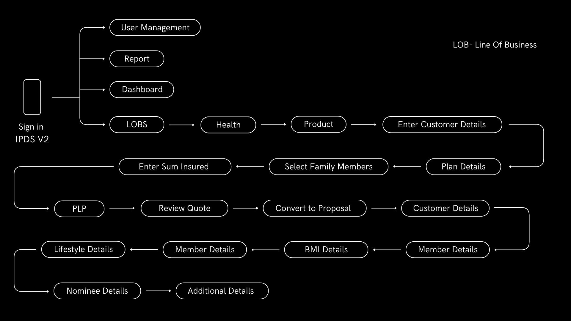
Quotation Retrieval was Hard
Before an agent could see a single product, IPDS V2 required name, date of birth, mobile number, email address, agent code, and policy preferences. The system was asking agents to do administrative work before it had done anything useful for them. In a real sales conversation with a client on a call or sitting across a table this sequence damaged trust before value had been demonstrated.
Extra Avoidable Hurdles
Fields that belong to the proposal stage appeared at the quote stage. Contact details, agent codes, and declared preferences were collected before a client had seen or chosen a product. This conflated two fundamentally different moments exploration, where a client is still deciding, and commitment, where paperwork begins. The portal forced commitment-stage friction into an exploration-stage conversation.
No Phase Separation
There was no architectural distinction between quote, proposal, and payment. These three activities which represent three entirely different conversations with a client, each with different stakes, timing, and information requirements collapsed into a single undifferentiated flow. Agents had to context-switch mid-conversation, re-enter data that should have carried forward, and navigate a portal that did not reflect how insurance is actually sold.
New Information Architecture
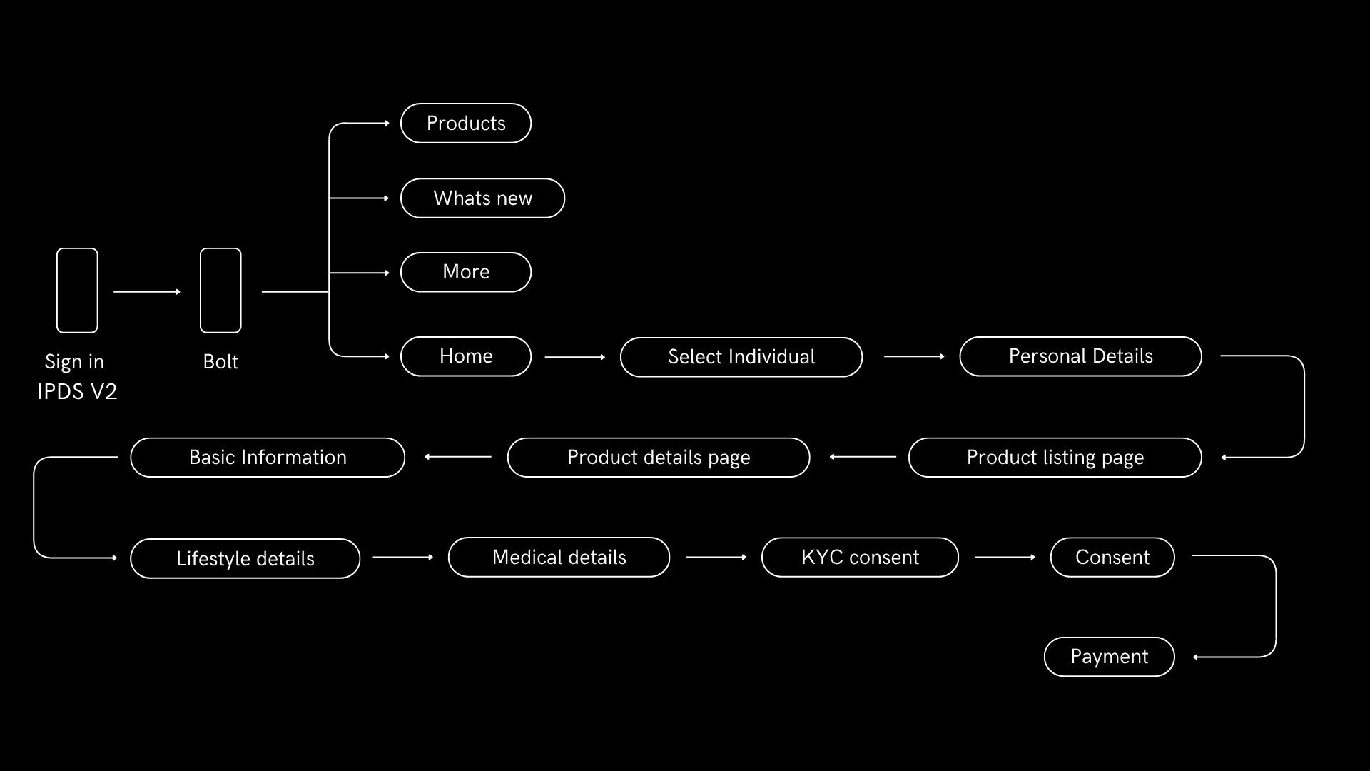
3-field quote input
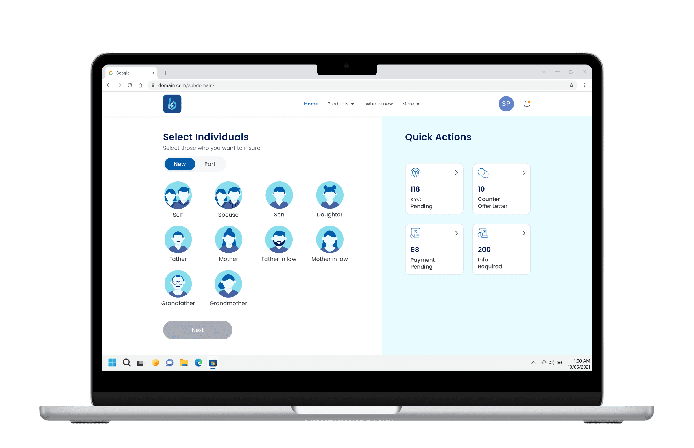
The entry point asks for exactly three things number of family members and their relationship to the client, their ages, and their pincode. That is it. These are the first three questions every agent interviewed told us they ask a client before anything else. The system now starts where the agent starts, not where the backend needs data. An agent can be in front of a product listing in under a minute.
Extra Avoidable Hurdles, Avoided
Contact details, lifestyle information, PAN verification, and nominee details only appear once a product has been selected and the agent has explicitly begun the proposal journey. A client who is still exploring sees none of this. A client who has chosen a product and is ready to proceed provides this information in a structured, step-by-step sequence at the moment it is actually needed, in the order it is actually needed, for the purpose they already understand. The portal no longer asks for commitment before it has earned it.
Gap between product listing and proposal journey
The stepper and everything that comes with it only appears once a product has been selected and the agent is ready to begin the proposal. Before that point, the agent is exploring on behalf of a client who has not committed to anything. After that point, the client has chosen and the paperwork begins. The architecture makes this distinction explicit and structural, not just visual.
© Quote उद्धरण
Insurance Quote
Pre Quote Flow
Before an agent could show a client anything of value, IPDS V2 required them to collect and enter the proposer's full name, date of birth, mobile number, email address, agent code, sum insured preference, and policy type among other fields. Several of these had nothing to do with generating a quote. They existed because the system needed them eventually, and rather than asking for them at the right moment, it asked for all of them at once.
In practice this meant an agent sitting across from a prospective client or on a call with them had to ask for personal contact details before a single product had been shown or discussed. It meant asking a client to declare a sum insured preference before they had seen what was available at what price. It meant entering an agent code on a portal the agent was already logged into.
Each individual field might seem minor in isolation. Collectively they created a delay between the moment an agent opened the portal and the moment anything useful appeared on screen. That delay had a cost in client attention, in conversation momentum, and in the impression the agent made. A portal that made an agent look slow or bureaucratic in front of a client was not a neutral tool. It was actively working against the sale.
Agents responded the way people always respond to friction they cannot remove they routed around it. Quote generation moved to Agent AUX and M-Connect. The portal became a last step rather than a first one. By the time agents reached IPDS V2 in their workflow, the sale was already done and they were there only to issue the policy. The portal had been reduced to a filing system.
Bolt's response was not to streamline the form. It was to ask what information was actually necessary at this stage and remove everything else. The answer, confirmed by every agent interviewed, was three things family members and their relationships, their ages, and their pincode. Everything else moved to the stage where it belonged.
Each individual field might seem minor in isolation. Collectively they created a delay between the moment an agent opened the portal and the moment anything useful appeared on screen. That delay had a cost in client attention, in conversation momentum, and in the impression the agent made. A portal that made an agent look slow or bureaucratic in front of a client was not a neutral tool. It was actively working against the sale.
Agents responded the way people always respond to friction they cannot remove they routed around it. Quote generation moved to Agent AUX and M-Connect. The portal became a last step rather than a first one. By the time agents reached IPDS V2 in their workflow, the sale was already done and they were there only to issue the policy. The portal had been reduced to a filing system.
Bolt's response was not to streamline the form. It was to ask what information was actually necessary at this stage and remove everything else. The answer, confirmed by every agent interviewed, was three things family members and their relationships, their ages, and their pincode. Everything else moved to the stage where it belonged.
Old Journey
IPDS V2 had not solved this. The proposal form was a continuous, undifferentiated sequence of fields with no visible indication of progress, no sense of how much remained, and no ability to navigate backwards without risking data loss. Personal details collected at the quote stage were not carried forward agents re-entered information a client had already provided. Lifestyle inputs had no context or explanation, leaving agents to justify sensitive questions from memory. The medical history step offered only a predefined list with no free-text option, forcing agents to mis-categorise conditions or omit them entirely. There was no review step before submission. Errors were discovered only after the underwriter flagged them, at which point corrections required resubmitting and if the OTP had expired in the meantime, starting over entirely. Agents described the post-submission experience as a black hole. The form disappeared and they waited, with nothing to tell their client.
© Proposal Form ज्ञानप्राप्ति
Custom Quotes
Product Page
Selecting a product from the listing page was not the end of a decision it was the beginning of one. The product description page was designed around the understanding that agents rarely sell a base plan. They sell a plan shaped around a client's specific situation their age, their family, their existing coverage gaps, their budget. The PDP is where that shaping happens.
Base Product View
The page opens with the product in its base form premium, sum insured, coverage duration, and key inclusions and exclusions laid out clearly. This gives the agent and client a shared starting point before any customisation begins. The base plan is not a stripped-down version to be upsold from it is a complete, viable product that stands on its own. Add-ons build on top of it, they do not complete it.
Add Ons
Add-ons are presented as a set of discrete, individually selectable enhancements each with a name, a plain-language description of what it covers, and its additional premium cost shown immediately. Nothing is hidden behind a tap or buried in fine print. An agent in a client conversation needs to be able to explain what each add-on does and what it costs in real time, without navigating away from the screen. The design supports that conversation directly. Each add-on is chargeable and priced transparently. The additional cost appears next to the add-on label before selection, not after. An agent should never be surprised by a number, and neither should a client.
Real Time Premium Recalculation
Every add-on selection updates the total premium immediately. There is no submit button, no loading state, no need to recalculate manually. The running total is persistent and visible at all times on desktop as a sticky summary panel, on mobile as a pinned footer. An agent can toggle add-ons on and off in front of a client and the number updates in real time. This turns a configuration screen into a conversation tool.
© Proposal Form ज्ञानप्राप्ति
All aboard
Proposal Form
The proposal form is where exploration ends and commitment begins. A client has chosen a product, configured it to their needs, and agreed to proceed. What follows is the most administratively intensive part of the agent's job collecting, verifying, and submitting the personal, medical, and lifestyle information the insurer needs to underwrite the policy. The design challenge was not to make this feel easy. It is not easy. The challenge was to make it feel manageable, structured, predictable, and free of the kind of friction that breaks a client's confidence mid-process.
New Proposal Form
Bolt's proposal form is seven discrete steps presented one at a time, with a stepper at the top that shows the agent and client exactly where they are, what remains, and what is coming next. Information entered earlier in the journey carries forward nothing is asked twice. Lifestyle inputs are written in neutral, present-tense language with tooltips that give agents the context they need to explain sensitive questions to a client in real time. The medical history step combines a structured list with a free-text field for conditions that do not fit a predefined category. Before submission, a dedicated review step shows a complete summary of everything entered every section editable from a single screen.
After submission, the agent sees a reference number, a clear status, and an honest indication of what happens next. Both the agent and the client leave the conversation knowing exactly what was submitted and what follows.
© System प्रणाली
All aboard
Bolt Design Lib
TATA AIG was building multiple agent-facing products without a shared visual language.The library was built to fix that at a structural level one source of truth for colour, type, spacing, and interaction patterns across products.
Components
Adoption
Variables
Time saved


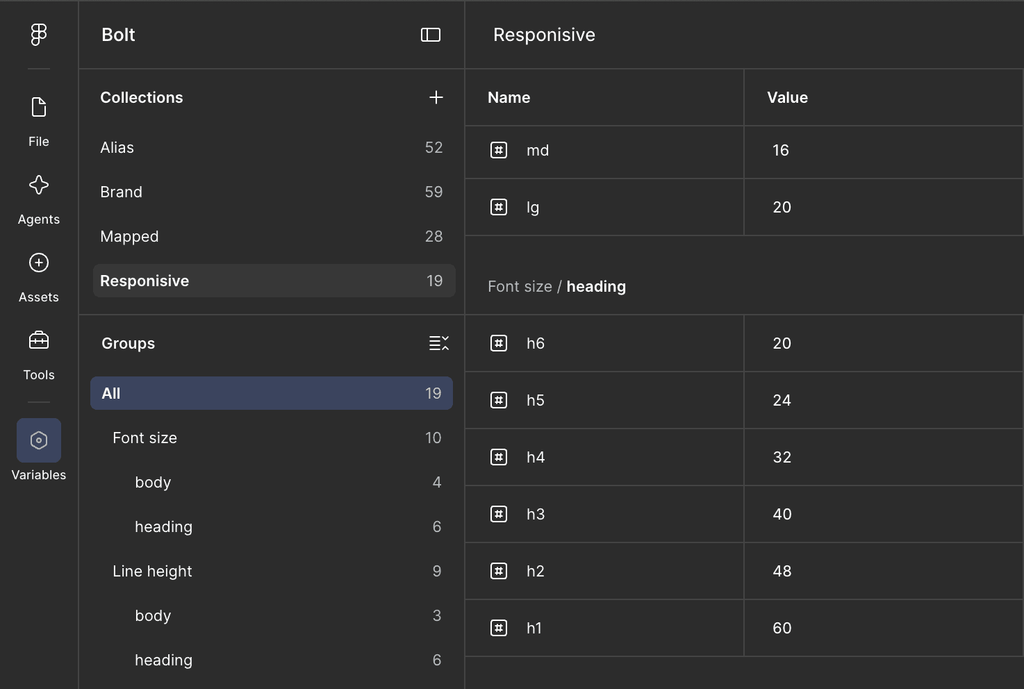
How is it maintained?
Released monthly through Figma's library publish, with a written changelog per version. Renamed or removed components stayed in place one cycle before deletion, so nobody's file broke mid-sprint. New component requests came through Teams and mails, I built anything used in three or more places.
© Audting लेखा परीक्षा
All aboard
Retrospective
Ultimately, the Bolt design library became more than just a UI toolkit it became a strategic asset for the health insurance business. In an industry where trust and clarity are paramount, Bolt ensured that every user touchpoint felt reliable, professional, and consistent. By streamlining our design and development workflows, we were able to bring new features to market faster, reducing operational bottlenecks and allowing the business to scale its digital health products with confidence.
© Audting लेखा परीक्षा
Checking
Retrospective
Ultimately, the Bolt design library became more than just a UI toolkit it became a strategic asset for the health insurance business. In an industry where trust and clarity are paramount, Bolt ensured that every user touchpoint felt reliable, professional, and consistent. By streamlining our design and development workflows, we were able to bring new features to market faster, reducing operational bottlenecks and allowing the business to scale its digital health products with confidence.

HERE LiDAR Data
(02)
TATA BOLT /
Web Portal for Insurance
End-to-end insurance policy journey
Project Scope:
Zero to Launch
Team Size:
1 PM, 6 Dev, 1 Designer
Duration:
9 Months
Platform:
Mobile/Desktop Web
Insurance
Redefined
Coverage shouldn't be complicated. Issue any policy, for any client, in just a few clicks.
© Summary सारांश
(WDX® — 01)
User Metrics
Outcome
Here is how the final solution moved the needle for the business
Retention
Adoption
Revenue Inc
Time Reduction
© Introduction परिचय
(WDX® — 02)
OLD experience
Context
Old
Portal
We needed to Design Bolt from the ground up a portal that fits how agents actually work, validated by research, and scalable enough that its design language (the Bolt Design Library) could serve other TATA AIG products including Nova.
IPDS V2- The Old Portal
A legacy portal built around the insurance company's internal data requirements. not around how agents actually work. It issued policies. But it made agents jump through hoops to do it.
Agents weren't using it the way it was intended. When asked what they use to generate quotes, the answers told the whole story Agent AUX, M-Connect, Excel spreadsheets,
and the portal itself used only for final policy issuance, not for the quote generation it was built to support. Agents had built their own workaround ecosystem because the portal didn't fit their workflow.
© User Research अनुसंधान
(WDX® — 03)
What Users Say
User Research
More than 85% of the people in India buy insurance policy from an insurance agent
I conducted approximately 8 interviews with practicing insurance agents across experience levels and business volumes from agents writing ₹62 lakh annual business to those writing ₹1.1 crore+
A deliberately mixed set covering product specialisations, geographies, and working styles.
A structured questionnaire was prepared ahead of each session. However, agents were more than happy to share experiences beyond its scope often the most valuable insights came from these unscripted moments. Every observation was captured, and several became defining design decisions in Bolt. These were the main insights that directly shaped Bolt
Agents use the portal for issuance, not quoting
Most agents had abandoned IPDS V2 for quote generation entirely. They used third-party apps like Agent AUX and M-Connect because those were faster and showed premiums across multiple companies. The portal was a last step, not a first one. Bolt had to earn back the earlier stages of the journey.
The quote input form was asking for too much, too early
Before getting to a product listing, agents were entering unnecessary data. Research revealed the minimum viable input set: number of family members and their relationship to the client, their ages, and their pincode. That's it. Everything else could wait until the proposal stage. This single insight defined the entire pre-listing experience.
Mobile number and email should not be required for quote generation
Multiple agents flagged this explicitly. Requiring contact details before a client has decided anything creates friction at the wrong moment and erodes trust with prospective policyholders.
A bug disguised as a feature
A 5-minute OTP before sending a payment link in a real-world scenario where an agent is on a call with a client was causing form data loss and re-entry. One agent noted this had been partially addressed (proposal number retrieval), but the root experience remained fragile.
Payment journey needs rethinking
The label "send link to customer" was functionally misleading. What agents needed was "generate payment link" something they could copy and send via WhatsApp, SMS, or any channel they were already using. A labelling and flow problem masquerading as a technical one.
Alternate contact details for payment are a real workflow need
In many cases, the person paying isn't the policyholder it's a family member. The portal had no field for an alternate email or phone number for the payment link. Agents were working around this manually.
DigiLocker-style auto-fill is the benchmark
One agent specifically mentioned a competitor portal (Care Health) that auto-fills all fields from a PAN card number and date of birth via DigiLocker. This set a clear expectation benchmark for what effortless data entry looks like.
Quote output needs to be shareable directly
The current portal showed only premium on the quote screen — no sum insured, no product summary. Agents were taking screenshots to share information with clients. A shareable, formatted quote output was an unmet need with immediate business value.
© User Personas यूज़र पर्सोना
(WDX® — 04)
User Classification
User Personas
Summary
After interviewing 8 insurance agents, three distinct personas emerged. Anjali is a socially savvy, full-time agent who blends networking with lead generation, using WhatsApp Business, Canva, and Instagram to build her brand and manage clients. Saanvi is a steady, relationship-driven agent who keeps things simple phone calls, WhatsApp, and internal tools are all he needs to maintain his loyal client base. Kabir is a young, part-time agent treating insurance as a side hustle, casually pitching to peers through Instagram and WhatsApp, and engaging with the platform mainly for quick quotes and commission tracking. Since, high yield agents are already doing well, we would like to see the other two kind of users to perform better as well. Especially the type 3 user, the potential is massive, even if we are able to transition just 10% of them to type 2 user, that would mean success for us.
Anjali seamlessly blends her personal and professional life by turning community networking into organic lead generation, while enjoying financial podcasts. She uses WhatsApp Business serving as her absolute lifeline for client communication and Truecaller helping her efficiently screen daily leads. To build social proof and project a reliable image, she designs personalised quotes and festival greetings using Canva and shares them across Facebook and Instagram. For her ongoing development and daily operations, she relies on YouTube for quick micro-training on sales techniques, uses UPI apps for seamless premium collections.
01
/ 03
Anjali
Age
46
Role
Agency Firm Owner
(High yield agent)
Ways of working
Manages a team of Agents/ Data entry operators
Has years of experience
Knowledgable
Uses portals like Agent AUX
Choice of device: Laptop
Uses Whatsapp to send documents/ links to clients
Deals with other insurance companies as well

As a solo, medium-yield agent, Saanvi builds her business on steady, long-term relationships. Her digital routine is functional and straightforward, relying heavily on standard phone calls and WhatsApp to personally manage his loyal client base without the complexities of team coordination. She uses apps like Dailyhunt or Moneycontrol to stay updated on financial trends so she can confidently answer client questions. For daily operations, she occasionally turns to YouTube for product explanations, but relies primarily on internal company enablement tools for her own ongoing training, tracking her commission tiers, and independently resolving operational disputes.
02
/ 03
Saanvi
Age
28
Role
Self employed
(Medium yield agent)
Ways of working
Works alone
Has few years of experience
Knowledgable
Uses portals like Agent AUX
Choice of device: Android phone
Uses Whatsapp to send documents/ links to clients
Deals with other insurance companies as well
As a young student running a side hustle, Kabir pitches policies casually to his peer network between gaming sessions. Highly mobile-first, he relies on Instagram and Snapchat for leads, WhatsApp for quick follow-ups, and UPI apps to manage his gig income. Short on time, he consumes YouTube Shorts for financial tips and logs into company enablement apps purely for fast digital quotes, checking immediate commissions, and tracking short-term gamified rewards.
03
/ 03
Kabir
Age
24
Role
Student
(Low yield agent)
Ways of working
Works alone
Is a novice in insurance industry
Uses portals like Agent AUX
Choice of device: Mobile
Uses Whatsapp to send documents/ links to clients
Deals with only one insurance company
© Ideation विचार
(WDX® — 05)
Thinking
Architecture
IPDS V2 had no formal information architecture documentation. The diagram below was reconstructed from agent interviews and direct portal walkthroughs conducted during the research phase. What it revealed was a system organised around data collection requirements not around the agent's workflow or the natural rhythm of an insurance sales conversation.
Old Information Architecture
Quotation Retrieval was Hard
Before an agent could see a single product, IPDS V2 required name, date of birth, mobile number, email address, agent code, and policy preferences. The system was asking agents to do administrative work before it had done anything useful for them. In a real sales conversation with a client on a call or sitting across a table this sequence damaged trust before value had been demonstrated.
Extra Avoidable Hurdles
Fields that belong to the proposal stage appeared at the quote stage. Contact details, agent codes, and declared preferences were collected before a client had seen or chosen a product. This conflated two fundamentally different moments exploration, where a client is still deciding, and commitment, where paperwork begins. The portal forced commitment-stage friction into an exploration-stage conversation.
No Phase Separation
There was no architectural distinction between quote, proposal, and payment. These three activities which represent three entirely different conversations with a client, each with different stakes, timing, and information requirements collapsed into a single undifferentiated flow. Agents had to context-switch mid-conversation, re-enter data that should have carried forward, and navigate a portal that did not reflect how insurance is actually sold.
New Information Architecture
3-field quote input
The entry point asks for exactly three things number of family members and their relationship to the client, their ages, and their pincode. That is it. These are the first three questions every agent interviewed told us they ask a client before anything else. The system now starts where the agent starts, not where the backend needs data. An agent can be in front of a product listing in under a minute.
Extra Avoidable Hurdles, Avoided
Contact details, lifestyle information, PAN verification, and nominee details only appear once a product has been selected and the agent has explicitly begun the proposal journey. A client who is still exploring sees none of this. A client who has chosen a product and is ready to proceed provides this information in a structured, step-by-step sequence at the moment it is actually needed, in the order it is actually needed, for the purpose they already understand. The portal no longer asks for commitment before it has earned it.
Gap between product listing and proposal journey
The stepper and everything that comes with it only appears once a product has been selected and the agent is ready to begin the proposal. Before that point, the agent is exploring on behalf of a client who has not committed to anything. After that point, the client has chosen and the paperwork begins. The architecture makes this distinction explicit and structural, not just visual.
© Quote उद्धरण
(WDX® — 06)
Insurance Quote
Pre Quote Journey
Before an agent could show a client anything of value, IPDS V2 required them to collect and enter the proposer's full name, date of birth, mobile number, email address, agent code, sum insured preference, and policy type among other fields. Several of these had nothing to do with generating a quote. They existed because the system needed them eventually, and rather than asking for them at the right moment, it asked for all of them at once.
In practice this meant an agent sitting across from a prospective client or on a call with them had to ask for personal contact details before a single product had been shown or discussed. It meant asking a client to declare a sum insured preference before they had seen what was available at what price. It meant entering an agent code on a portal the agent was already logged into.
Each individual field might seem minor in isolation. Collectively they created a delay between the moment an agent opened the portal and the moment anything useful appeared on screen. That delay had a cost in client attention, in conversation momentum, and in the impression the agent made. A portal that made an agent look slow or bureaucratic in front of a client was not a neutral tool. It was actively working against the sale.
Agents responded the way people always respond to friction they cannot remove they routed around it. Quote generation moved to Agent AUX and M-Connect. The portal became a last step rather than a first one. By the time agents reached IPDS V2 in their workflow, the sale was already done and they were there only to issue the policy. The portal had been reduced to a filing system.
Bolt's response was not to streamline the form. It was to ask what information was actually necessary at this stage and remove everything else. The answer, confirmed by every agent interviewed, was three things family members and their relationships, their ages, and their pincode. Everything else moved to the stage where it belonged.
© Description विवरण
(WDX® — 07)
All aboard
Product Description
Selecting a product from the listing page was not the end of a decision it was the beginning of one. The product description page was designed around the understanding that agents rarely sell a base plan. They sell a plan shaped around a client's specific situation their age, their family, their existing coverage gaps, their budget. The PDP is where that shaping happens.
Base Product View
The page opens with the product in its base form premium, sum insured, coverage duration, and key inclusions and exclusions laid out clearly. This gives the agent and client a shared starting point before any customisation begins. The base plan is not a stripped-down version to be upsold from it is a complete, viable product that stands on its own. Add-ons build on top of it, they do not complete it.
Add Ons
Add-ons are presented as a set of discrete, individually selectable enhancements each with a name, a plain-language description of what it covers, and its additional premium cost shown immediately. Nothing is hidden behind a tap or buried in fine print. An agent in a client conversation needs to be able to explain what each add-on does and what it costs in real time, without navigating away from the screen. The design supports that conversation directly. Each add-on is chargeable and priced transparently. The additional cost appears next to the add-on label before selection, not after. An agent should never be surprised by a number, and neither should a client.
Real Time Premium Recalculation
Every add-on selection updates the total premium immediately. There is no submit button, no loading state, no need to recalculate manually. The running total is persistent and visible at all times on desktop as a sticky summary panel, on mobile as a pinned footer. An agent can toggle add-ons on and off in front of a client and the number updates in real time. This turns a configuration screen into a conversation tool.
© Proposal Form ज्ञानप्राप्ति
(WDX® — 08)
All aboard
Proposal Form
The propaosal form is where exploration ends and commitment begins. A client has chosen a product, configured it to their needs, and agreed to proceed. What follows is the most administratively intensive part of the agent's job collecting, verifying, and submitting the personal, medical, and lifestyle information the insurer needs to underwrite the policy. The design challenge was not to make this feel easy. It is not easy. The challenge was to make it feel manageable,structured, predictable, and free of the kind of friction that breaks a client's confidence mid-process.
Old Journey
IPDS V2 had not solved this. The proposal form was a continuous, undifferentiated sequence of fields with no visible indication of progress, no sense of how much remained, and no ability to navigate backwards without risking data loss. Personal details collected at the quote stage were not carried forward agents re-entered information a client had already provided. Lifestyle inputs had no context or explanation, leaving agents to justify sensitive questions from memory. The medical history step offered only a predefined list with no free-text option, forcing agents to mis-categorise conditions or omit them entirely. There was no review step before submission. Errors were discovered only after the underwriter flagged them, at which point corrections required resubmitting and if the OTP had expired in the meantime, starting over entirely. Agents described the post-submission experience as a black hole. The form disappeared and they waited, with nothing to tell their client.
New Proposal Form
Bolt's proposal form is seven discrete steps presented one at a time, with a stepper at the top that shows the agent and client exactly where they are, what remains, and what is coming next. Information entered earlier in the journey carries forward nothing is asked twice. Lifestyle inputs are written in neutral, present-tense language with tooltips that give agents the context they need to explain sensitive questions to a client in real time. The medical history step combines a structured list with a free-text field for conditions that do not fit a predefined category. Before submission, a dedicated review step shows a complete summary of everything entered every section editable from a single screen.
After submission, the agent sees a reference number, a clear status, and an honest indication of what happens next. Both the agent and the client leave the conversation knowing exactly what was submitted and what follows.
© System प्रणाली
(WDX® — 09)
All aboard
Bolt Design Library
TATA AIG was building multiple agent-facing products without a shared visual language.The library was built to fix that at a structural level one source of truth for colour, type, spacing, and interaction patterns across products.
Components
Adoption
Variables
Time saved
How is it maintained?
Released monthly through Figma's library publish, with a written changelog per version. Renamed or removed components stayed in place one cycle before deletion, so nobody's file broke mid-sprint. New component requests came through Teams and mails, I built anything used in three or more places.
© Proposal Form ज्ञानप्राप्ति
(WDX® — 10)
All aboard
Retrospective
The underwriter persona needed its own research session I designed the underwriter portal based on workflow understanding, but I couldn't interview underwriters the way I interviewed agents. A dedicated session with underwriters would have surfaced the same quality of insight that agent interviews gave the quote and proposal journey.